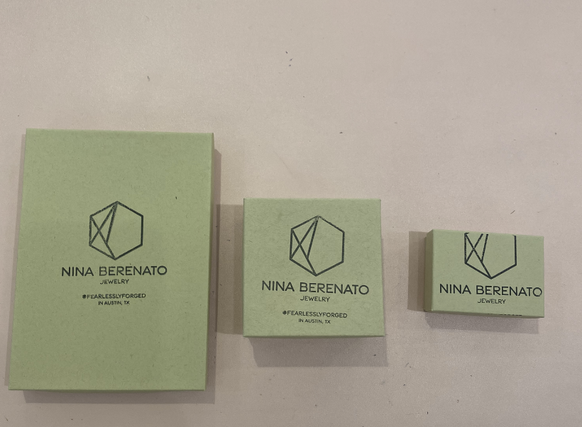
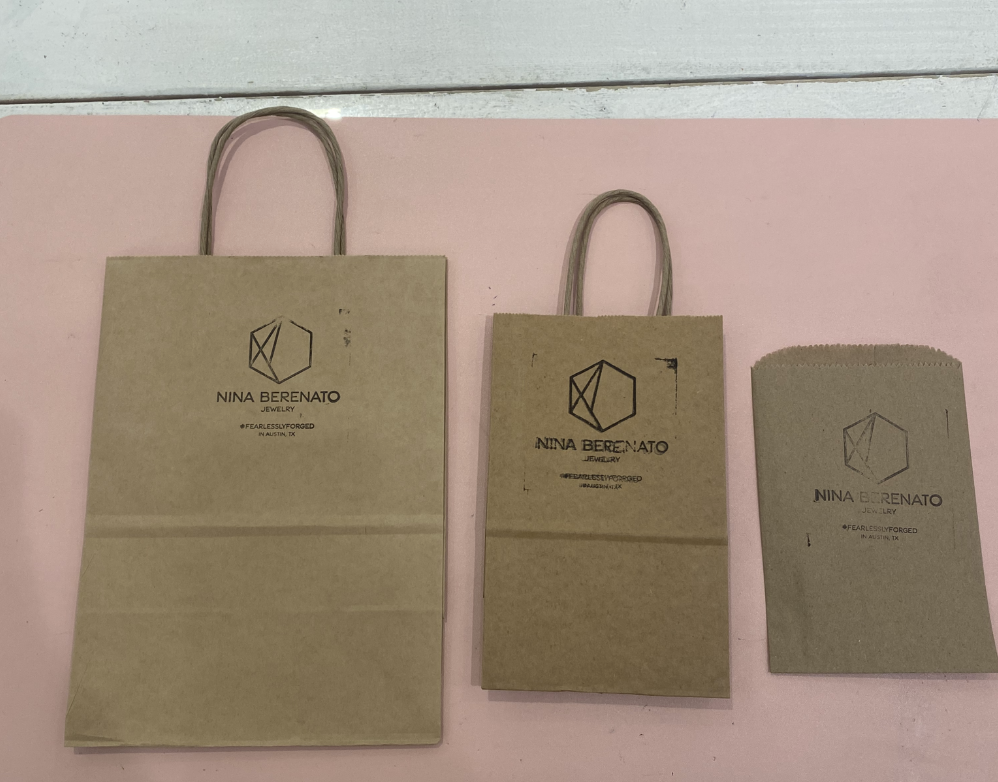
A world where fossils and fire exists, the logotype was inspired by the organic shapes found in nature specifically fossils and the fire that breathes life into jewelry making. The logotype was created with taking on an organic approach to forming the letters resulting in hand drawn letters. The sun rays was a nod to fire, community, confidence, and joy emitting from the heart of the NB brand.
At its core, the Nina Berenato logo is a nod to fossils and the process of jewelry making. The logo is bold, modern, and imperfectly perfect, with supporting sun rays as a personal touch to those who embody the positive, empowering jewelry attitude.
project details →
Aligned their brand system, toward a refreshed modern look that mirrored the brand’s growth.
success highlights →
SUCCESS :The… TBD
about the brand →
Each piece of Nina Berenato’s collection is handcrafted by Nina and her all-girl team in Austin, TX. From her humble beginnings as a metalsmith’s apprentice in Brooklyn to outfitting fashion-forward celebrities like Beyonce, Megan Thee Stallion, Lizzo and Angelina Jolie, it’s obvious that Nina walks through life with her eyes open, bringing a one-of-a-kind vision to each design. A large part of Nina Berenato’s brand identity rests on the designer’s goal to use her gift for design to make the women In her community feel powerful, beautiful and capable of anything.
A world where fossils and fire exists, the logotype was inspired by the organic shapes found in nature specifically fossils and the fire that breathes life into jewelry making. The logotype was created with taking on an organic approach to forming the letters resulting in hand drawn letters. The sun rays was a nod to fire, community, confidence, and joy emitting from the heart of the NB brand.
At its core, the Nina Berenato logo is a nod to fossils and the process of jewelry making. The logo is bold, modern, and imperfectly perfect, with supporting sun rays as a personal touch to those who embody the positive, empowering jewelry attitude.
project details →
Aligned their brand system, toward a refreshed modern look that mirrored the brand’s growth.
success highlights →
Through our optical lift of the brand zelf. has gone from struggling for over a year to (a) close their 1st brand and (b) build out their advisor board — to , within just a few months of launching our work together, having an A-list advisor roster and some of TikTok’s most exciting brands. They also just launched their next round of funding this week and are closing in on meeting their goal.
Brands Including:
Liquid Death
Bubble Skincare
Macy’s
Blue Mercury
Monday
Daiso
Advisory Board Including:
TikTok, Current Head of Content Monetization
VP of Digital Growth for the NBA / Former Head of Growth for Cameo
CSO for Spotter / Former VP of Marketing for Netflix
Former Twitter Head of Content
Former CMO of Post & Reckitt
VP of Marketing for Maybelline
Former Head of Community for Uber
about the brand →
Each piece of Nina Berenato’s collection is handcrafted by Nina and her all-girl team in Austin, TX. From her humble beginnings as a metalsmith’s apprentice in Brooklyn to outfitting fashion-forward celebrities like Beyonce, Megan Thee Stallion, Lizzo and Angelina Jolie, it’s obvious that Nina walks through life with her eyes open, bringing a one-of-a-kind vision to each design. A large part of Nina Berenato’s brand identity rests on the designer’s goal to use her gift for design to make the women In her community feel powerful, beautiful and capable of anything.
Click on the BEFORE images below get a better view of where the brand was initially.
How We Evolved The Nina Berenato Brand.
Our customers love the rebrand and we have gotten so many positive comments about the new logo. We have received so many DMs letting us know how it feels "so us" which we love!
I enjoyed working with DMC. I felt like Kiko really understood the direction we wanted to go in and the team was overall very easy to work. I felt like we collaborated together really well. Everything was delivered on time and the communication was great!


